Jetpack Compose 2026 年 8 月版本详解:Compose 1.12 赋能应用高效开发
原创 Android 2026-09-22 18:20 北京

Jetpack Compose 2026 年 8 月稳定版现已推出。本文聚焦 Compose 1.12 核心模块,助力开发者快速掌握新功能并运用至工作流中,打造更优质的开发体验。

作者 / Jetpack Compose 产品经理 Nick Butcher
近期,Jetpack Compose 2026 年 8 月稳定版已正式发布!此版本将核心 Compose 模块全面升级至 1.12 (如需了解更多详情,请参阅完整的 BOM 映射),带来了丰富的视觉 API,例如网格渐变和广色域 (WCG) 支持,新增了网格 (Grid) 布局中的命名区域等结构化布局功能,同时还实现了与 Android 凭据管理器 (Credential Manager) 的无缝集成,以及进行了重要测试和性能方面的改进。
🔗 BOM 映射
https://developer.android.com/develop/ui/compose/bom/bom-mapping
如需将您的项目更新到该版本,请将 Compose BOM 版本升级到 2026.08.00:
implementation(platform("androidx.compose:compose-bom:2026.08.00"))🔗 Compose BOM
https://developer.android.com/develop/ui/compose/bom
重大变更
AGP 和 Compile SDK:Compose 1.12 将 compileSdk 更新至 API 37,最低 AGP 版本要求为 9.1.1。需要注意的是,Compose 始终会以最新版本的 compileSdk 为目标版本。如需了解更多详情,请参阅我们的文档:
Modifier.onFirstVisible() 已弃用:请迁移至 Modifier.onVisibilityChanged(),后者将提供更精确的可见性阈值跟踪能力。
🔗 Modifier.onVisibilityChanged()

Graphics
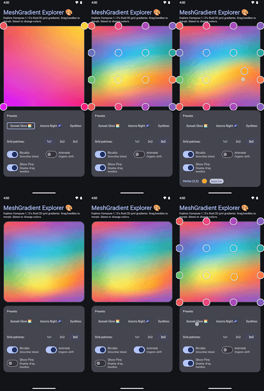
网格渐变
Compose 1.12 引入了 MeshGradientPainter,可帮助您创建多点、自然的颜色渐变。
🔗 MeshGradientPainter
https://developer.android.com/reference/kotlin/androidx/compose/ui/graphics/MeshGradientPainter
val rows = 1val columns = 1val gradientPainter = remember {MeshGradientPainter(rows, columns) {// Parameters: row, column, position, colorsetVertex(0, 0, Offset(0f, 0f), Color.Red) // Top-LeftsetVertex(0, 1, Offset(1f, 0f), Color.Blue) // Top-RightsetVertex(1, 0, Offset(0f, 1f), Color.Green) // Bottom-LeftsetVertex(1, 1, Offset(1f, 1f), Color.Yellow) // Bottom-Right}}Box(modifier = modifier.aspectRatio(16/9f).fillMaxWidth().paint(gradientPainter))
如需了解详细信息和示例,请参阅我们的文档:
https://developer.android.com/develop/ui/compose/graphics/draw/mesh-gradient
广色域和 HDR 支持
现代显示器提供更广的色彩保真度和更高的动态范围。在 Compose 1.12 中,Compose 的图形、绘制和着色器均已全面支持广色域 (P3) 和 HDR 渲染。在非 sRGB 色彩空间 (例如 Display P3) 中定义的颜色现在也能保留至平台渲染环节,而不会进行颜色截断 (Color Clamping)。如果颜色使用不支持的色彩空间 (例如 CieXyz、CieLab 或 Oklab)、依赖于 Android 版本上不支持的色彩空间 (例如 Android 13 及更低版本上的 Bt2020Hlg),或者应用运行在 Android 9 (API 28) 及更低版本上,颜色将安全地回退到 sRGB。
其他显著变更:
在 GraphicsLayer 和 Modifier.graphicsLayer 中添加了 LayerOutsets,您可以借此将图层的视觉边界扩展到其测量尺寸之外。当图层被提升为离屏缓冲区时,应用 LayerOutsets 可以避免隐式的 clipToBounds 行为。
🔗 LayerOutsets
https://developer.android.com/reference/kotlin/androidx/compose/ui/graphics/LayerOutsets
Styles
在 Google I/O 大会上,我们分享了关于 Compose Styles API 的初步构想:一种统一且高效的组件样式设置方式。此后,我们持续构建其底层架构,以确保严格的类型安全性和可预测的正确性,同时支持构建自定义设计系统。
🔗 Styles API
https://developer.android.com/develop/ui/compose/styles
为了确保这一基础底层架构的正确性,该 API 将继续处于实验性阶段,后续也可以期待我们的重大变更。
运行时优化
支持 Key 参数的 SideEffect 重载
SideEffect 现已支持传入 key 参数,可借此在指定 key 发生变化时触发一次性副作用。当不需要协程或清理代码块时,相比使用 LaunchedEffect 或 DisposableEffect,这种方式可以带来更好的性能。SideEffect 的速度最高可比 LaunchedEffect 快 90%,比 DisposableEffect 快约 20%。需要注意的是,SideEffect 会在 DisposableEffect 和 LaunchedEffect 之前运行。因此,迁移现有副作用时需格外谨慎,特别是那些依赖当前帧渲染完成后才调度执行的 LaunchedEffect。
funAnalyticsTracker(userId: String, screenName: String) {SideEffect(key1 = userId, key2 = screenName) {analytics.logScreenView(userId, screenName)}}
🔗 SideEffect
https://developer.android.com/reference/kotlin/androidx/compose/runtime/SideEffect.composable
动画制作
DeferredTargetAnimation 也已正式发布:
交互式两阶段过渡
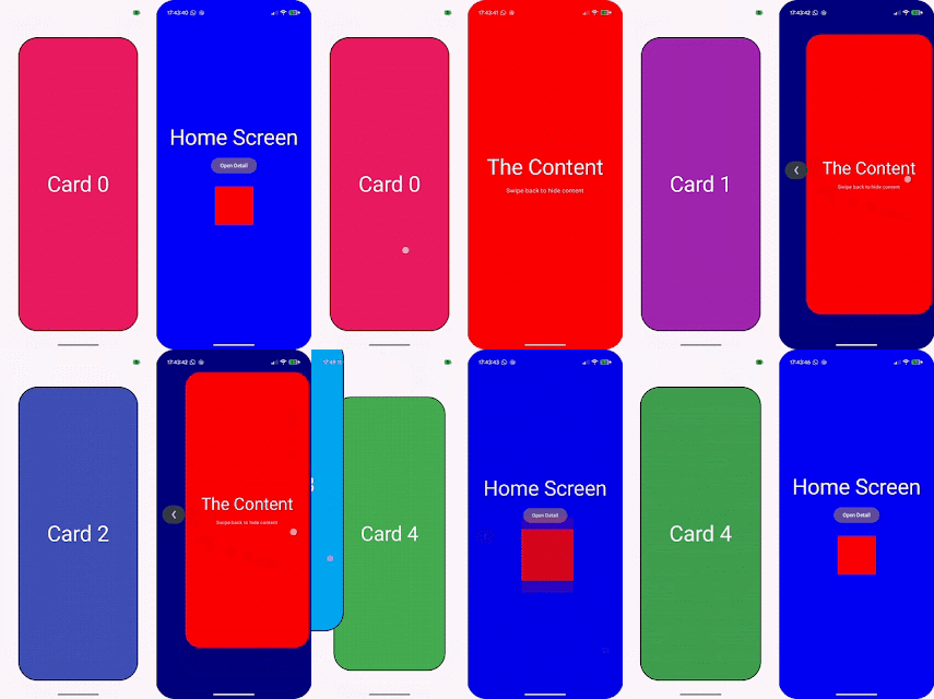
新增可组合项:DeferredAnimatedContent 和 DeferredAnimatedVisibility 可用于构建流畅的两阶段过渡效果,例如用于预测性返回手势跟踪。
手动控制动画:在过渡的延迟阶段,现在可以实时手动控制动画属性 (例如缩放或偏移),从而实现与滑动手势同步的交互效果。
无缝交接:延迟阶段结束后,过渡引擎就会接管流程并执行无缝交接 (包括速度传递),以实现自动过渡。
共享元素支持:SharedContentConfig 新增了 permitTransformDuringDeferredTransition 标志,用于控制共享元素在延迟过渡阶段是否随其父容器一起进行视觉变换。
val state = remember { DeferredTransitionState(initialScreen) }val transition = rememberDeferredTransition(state)if (predictiveBackInProgress) {state.defer(targetScreen)} else {state.animateTo(targetScreen)}transition.DeferredAnimatedContent(targetState = targetScreen,mutableTransformSpec = {MutableContentTransform {// Manually manipulate properties during the deferred phaseinitialContentTransform { scale = swipeProgress }}}) { screen ->ScreenContent(screen)}
🔗 DeferredAnimatedContent
🔗 DeferredAnimatedVisibility
🔗 permitTransformDuringDeferredTransition
以下是两个手势驱动动画切换至触发动画的用例演示:
文本、输入与平台集成
可编辑文本格式化
新的 API 为 BasicTextField 中的可编辑文本提供了富文本格式化设置。现在,可以使用 SpanStyle 和 ParagraphStyle,在 TextFieldBuffer 作用域内通过新增的 addStyle() 方法 (例如在 textFieldState.edit { ... } 或 InputTransformation 中) 以编程方式应用和操作行内字符和段落格式。此外,TextFieldBuffer 还提供了 getSpanStyles() 和 getParagraphStyles() API,用于返回 TrackedRange 对象,便于开发者读取、更新或移除已应用的样式。为了完善格式创建功能,TextFieldState 现在公开了一个只读的 textStyles 属性,用于查询跨范围的活动样式;而 TextFieldBuffer 则提供了 originalTextStyles,用于在编辑之前检查格式状态。文本格式和自定义注释会在配置变更后持久化。
val state = rememberTextFieldState("Formatted text in Compose 1.12")// Apply bold and color styles to a range of textstate.edit {addStyle(SpanStyle(fontWeight = FontWeight.Bold, color = Color.Blue),start = 0,end = 9)}// Query active styles from TextFieldStateval currentStyles = state.textStyles
🔗 BasicTextField
🔗 SpanStyle
https://developer.android.com/reference/kotlin/androidx/compose/ui/text/SpanStyle
🔗 ParagraphStyl
https://developer.android.com/reference/kotlin/androidx/compose/ui/text/ParagraphStyle
🔗 TextFieldBuffer
文本选择
新的 SelectionState API 提供了对 SelectionContainer 内文本选择的编程控制和可观察性。通过 rememberSelectionState() 提升 SelectionState 对象并将其传递给 SelectionContainer,即可将 selectedTexts 公开为一个响应式的 AnnotatedStrings 列表,并提供诸如 selectAll()、clear()、select(TextRange) 和 extendSelectionByWord() 等方法。
🔗 SelectionState
🔗 SelectionContainer
此外,还可以使用 getSelectableTexts() 按布局顺序检索所有可选文本项,并使用全局范围选择 SelectionContainer 中可组合组件之间的文本。
funProgrammaticSelectionExample() {val selectionState = rememberSelectionState()Column {Button(onClick = { selectionState.selectAll() },modifier = Modifier.disableSelectionClearOnTap()) {Text("Select All")}SelectionContainer(state = selectionState) {Text("Text content to be selected programmatically.")}}}
凭据管理器集成
Compose 文本输入框现在可通过自动填充框架 (API 34 以下版本由 androidx.credentialslibrary 处理) 原生集成 Android 凭据管理器 (API 34+)。通过为 credentialRequest 语义属性附加 CredentialRequestData,文本输入框可以直接在用户输入流程中提示通行密钥、已保存的凭据或登录请求。
funLoginField(textFieldState: TextFieldState) {val credentialData = remember {CredentialRequestData(// Specify Credential Manager request options)}BasicTextField(state = textFieldState,modifier = Modifier.semantics {credentialRequest = credentialData})}
🔗 androidx.credentialslibrary
https://developer.android.com/jetpack/androidx/releases/credentials
🔗 credentialRequest
其他显著变更:
支持可下载字体中的字体可变设置。
在 SelectionContainer 中,当文本选择拖动到视口之外时,启用自动滚动。
为 Compose 组件添加了对自动交互音效 (点击和焦点导航) 的支持,并新增了一个 SoundEffectOnInteraction 可组合项,允许用户选择关闭此功能。需要注意的是,受此变更影响,语义点击监听器 (Semantics click listeners) 现在必须从主线程调用,这可能会影响少量测试用例。
KeyboardType 现在包含 Date、Time、DateTime 和 SignedDecimal。
BasicSecureTextField 现在默认使用 TextObfuscationMode.System,而 RevealLastTyped 则作为绝对覆盖选项使用。
🔗 可下载字体
https://developer.android.com/develop/ui/compose/text/fonts#downloadable-fonts
🔗 SelectionContainer
🔗 SoundEffectOnInteraction
🔗 KeyboardType
https://developer.android.com/reference/kotlin/androidx/compose/ui/text/input/KeyboardType
🔗 BasicSecureTextField
布局增强
网格布局 (Grid Layout) 中的命名区域
借助 @Experimental Grid 组件中的命名区域,构建复杂的 2D 布局变得更加轻松。开发者无需再跨项管理数字列和行索引,而是可以在 GridConfigurationScope 中定义语义区域,并按区域名称定位可组合项。
funDashboardLayout() {Grid(config = {area("header", row = 0, column = 0, rowSpan = 1, columnSpan = 2)area("sidebar", row = 1, column = 0)area("content", row = 1, column = 1)gap(16.dp)}) {HeaderSection(modifier = Modifier.gridItem(areaId = "header"))NavigationSidebar(modifier = Modifier.gridItem(areaId = "sidebar"))MainContentView(modifier = Modifier.gridItem(areaId = "content"))}}
🔗 Grid
https://developer.android.com/reference/kotlin/androidx/compose/foundation/layout/Grid.composable
如需了解详细信息,请参阅相关文档:
https://developer.android.com/develop/ui/compose/layouts/adaptive/grid/container-properties#named-area
性能
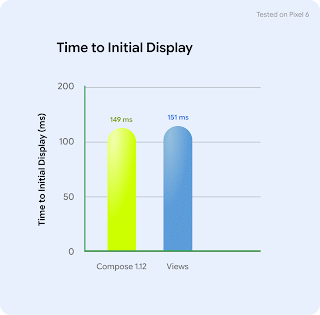
与以往版本一样,我们持续深耕 Compose 的性能优化,以确保该框架能够帮助开发者构建美观且高性能的应用。在此版本中,我们专注于提升启动性能,目前我们的基准测试显示,初始显示时间 (应用生成第一帧所需的时间) 已与 View 的性能相当。
🔗 基准测试
hhttps://developer.android.com/develop/ui/compose/performance/herobenchmark
测试与工具升级
测试同步
Compose 1.12 引入了新的测试 API,旨在缩短测试执行时间并消除状态采样期间的不稳定性:
hasPendingWork:被动地检查界面是否有待处理的任务,且不会推进测试时间线,非常适合用于手动动画循环。
runWithoutImplicitWait:在手动逐步推进时钟帧 (如进行动画测试) 时,临时禁用隐式同步。
funtestAnimationStateFast() {composeTestRule.mainClock.autoAdvance = falsewhile (composeTestRule.hasPendingWork()) {composeTestRule.mainClock.advanceTimeByFrame()composeTestRule.waitForIdle()composeTestRule.runOnUiThread {composeTestRule.runWithoutImplicitWait {// This is most effective when querying multiple nodes in a single frame.// It prevents the redundant synchronization overhead that would// otherwise occur on every individual query.val box1 = composeTestRule.onNodeWithTag("Box1").fetchSemanticsNode()val box2 = composeTestRule.onNodeWithTag("Box2").fetchSemanticsNode()assertThat(box1.boundsInRoot.right).isAtMost(box2.boundsInRoot.left)}}}}
🔗 hasPendingWork
🔗 runWithoutImplicitWait
其他显著变更:
captureToImage API 现在支持将弹出窗口或对话框及其锚点一同捕获并生成为单个位图。
新增 onRootWithViewInteraction,用于将 Compose 语义搜索的范围限定在特定的 Android View 中。这简化了混合界面 (例如 RecyclerView) 的测试,无需在生产代码中使用唯一的测试标签。
现在可以将 @PreviewWrapper 注解应用于自定义的 @MultiPreview 类,从而在多个组件中实现可复用的预览设置 (例如自定义主题)。
🔗 captureToImage
🔗 onRootWithViewInteraction
https://developer.android.com/develop/ui/compose/testing/interoperability#viewscoped-semantics
🔗 @PreviewWrapper
https://developer.android.com/reference/kotlin/androidx/compose/ui/tooling/preview/PreviewWrapper
祝您拥有愉快的
Compose 开发体验!
Compose 1.12 中新增的网格渐变、广色域支持、可下载的可变字体、凭证管理器集成以及更快的测试工具都让应用开发比以往任何时候都更加轻松且更具表现力。我们一如既往地重视您的反馈,请在我们的问题跟踪器中分享您对这些变更的反馈,或您希望看到的后续功能。祝您的 Compose 开发之旅愉快!
🔗 问题跟踪器
https://issuetracker.google.com/issues/new?component=612128
欢迎您持续关注 "Android 开发者" 微信公众号,及时了解更多开发技术和产品更新等资讯动态。

本文转载自微信公众号「Android 开发者」,查看原文。版权归原作者所有,如有侵权请联系删除。